
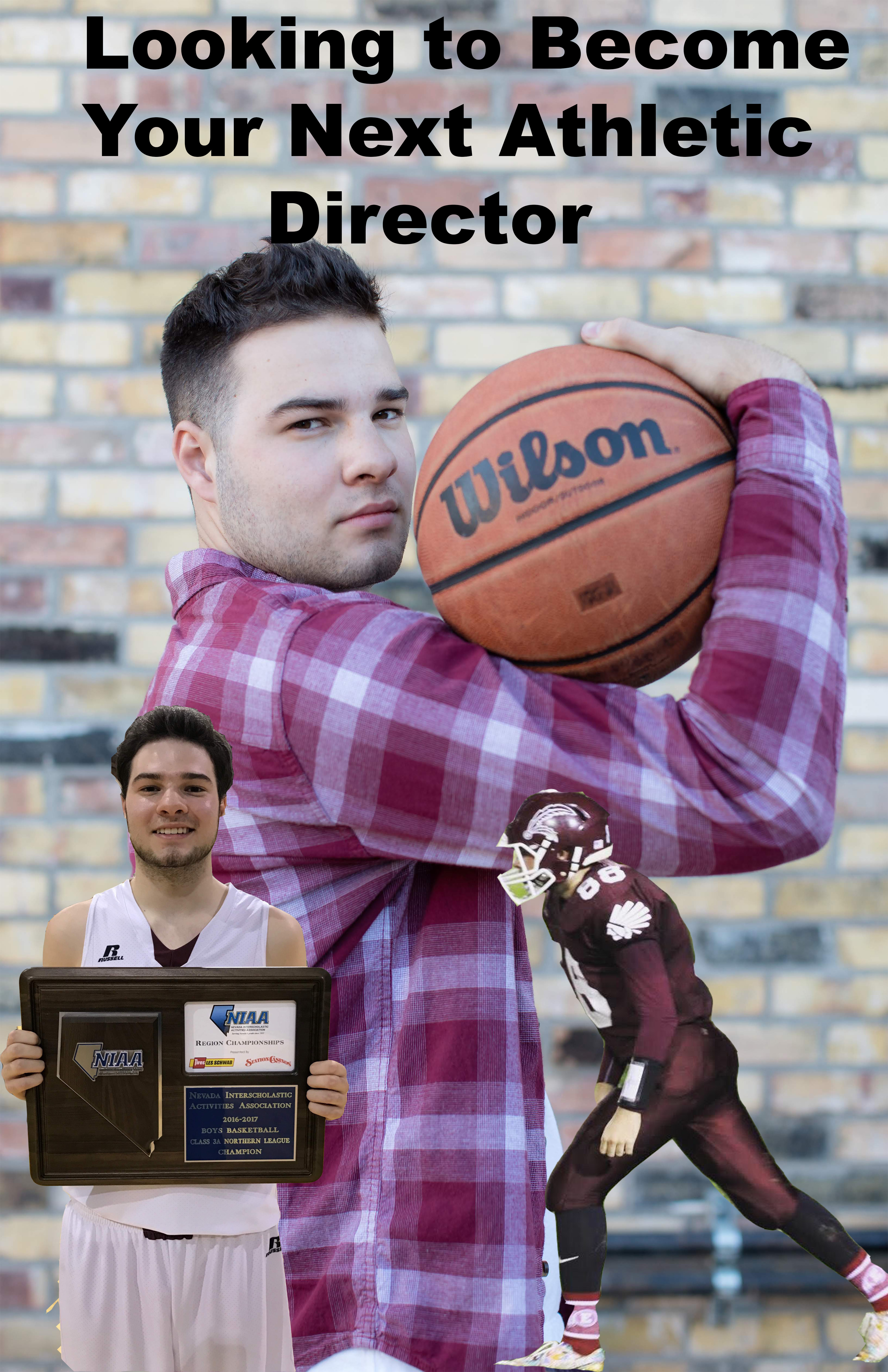
For the Graphic Design Project, I decided to create a poster advertising myself as an Athletic Director. I decided to base my poster off of images of me playing sports, to show that I have experience playing and watching sports and would be very knowledgeable as an AD. These images are very important to me personally because they are from a period of time in which I was a multi-sport athlete, which I am very proud of. The image on the left is a photo of me holding the regional title trophy after I won my third one in a row. This is one of my favorite images as this was one of my happiest moments to this point in time. I selected to use it because it shows that I didn’t just play sports, I was successful in them. This will translate well to a program looking for a new Athletic Director because obviously, their number one goal is to win championships.
I decided to do a poster after researching many different types of graphic designs. I got inspiration for how to lay out my poster from a video that I watched on Adobe’s website. I used the technique involving the magnetic lasso tool to cut out the two images of me playing and then layered them on top of my favorite image from my senior photos, one of me holding a basketball (my favorite sport). I then used the text to create a graphic up top to illustrate to potential employers exactly what it is that I’m advertising. these photos were taken by my mom and the main one by a professional photographer. I asked my mom if I could use them, and the main one I bought the rights to when I paid the photographer. This is just the rough draft, and I will add improvements to make it more appealing to the eye. I like the direction it is headed in so far though.

I like the design you have going! First off, I love the variety of photos you have chosen, they give off the vibe that you’re multi-faceted in sports, which I know is what you are going for as you want to be an athletic director. However, I would blend the two overlaying photos a bit more. Right off the bat, they seem like they don’t belong. Obviously each one is indeed a different photo, but each photo has different colors and lighting, and that makes for the two overlaying photos to look too much like they don’t belong there. I would suggest possibly playing with the exposure, the contrast, and the opacity of the two overlaying photos so that each photo blends in slightly more with the background and so that they don’t appear to not belong. Another way you could do this is by editing your background photo and making the colors pop more on that so that the other two don’t look so bright! You can do this by clicking on the layer with the background and again playing with the contrast, or you could up the saturation slightly. All in all, this is a solid rough draft. Your text pops but isn’t distracting, and once you blend the photos a bit more, I see this as a 10/10!
LikeLike
I think your project is very strong in the aspect of advertising yourself and your qualities that would make you a good athletic director. I like how you included images of yourself playing various sports, these definitely conveyed your involvement and experience with sports. I also think that the images that you cut out of yourself were cut out extremely neatly and precisely, they demonstrated excellent use of the magnetic lasso tool. One suggestion for improvement could be perhaps using a different text for “Looking to Become Your Next Athletic Director”. I think a font with more style to it could be used to add more professionality to the photo and also legitimize yourself a bit more to your audience. I also think another suggestion for improvement could be to add more images of either yourself or of other sporting activities, just to bring an even greater sense of “athletics” to your design. Despite these two suggestions however I think this project has very good base start and it is a very good campaign for your athletic director career.
LikeLike
After looking at my classmates comments and looking back at it myself, There are a few things that I will change on it moving forward. First off I think that the text doesn’t have the right font right now. I plan to change it to something that fits in better, and maybe changing the color and size. The next thing is that I want to find more of my sports photos that I can put in to make it look cooler then just the two. I am also definitely going to blend in the two overlaid photos. They do look a bit out of place right now. Once I fix it you shouldn’t be able to tell that it’s different layers. Changing the exposure and opacity will help with it. I think that i have a good start so far, now I just need to make these small improvements and it will be good for the final.
LikeLike