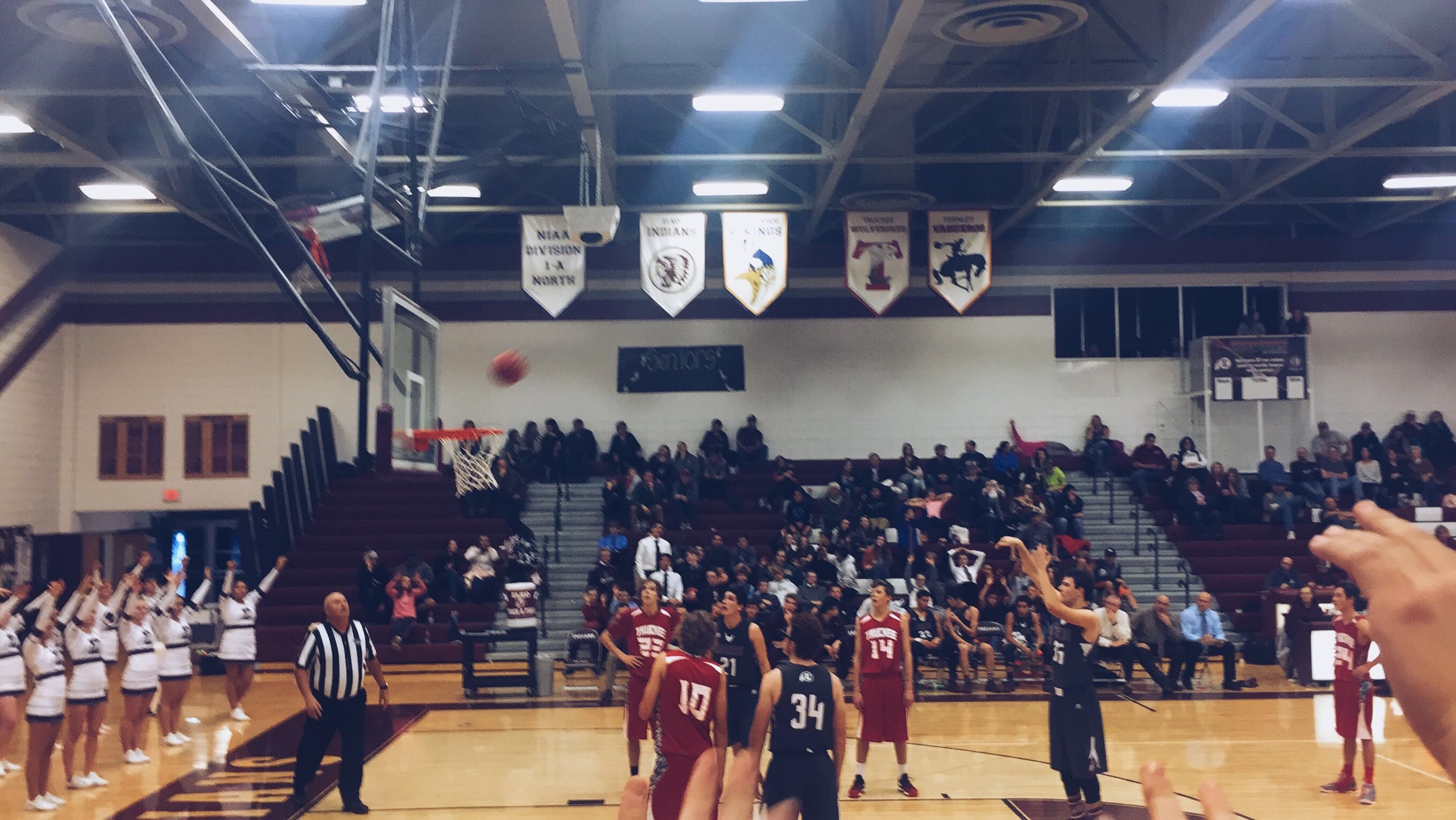
For this project, I was supposed to create a logo that represents my blog. My blog is about my journey to becoming an Athletic Director, so it only fit that I add a basketball. I know that my draft looks different then my sketch did. I left out football and baseball. I did this because I wasn’t able to add them without it looking cluttered and unprofessional. I was inspired by most sports teams and brands logos because in sports there is a tendency to make logos that are fairly basic and straight forward. I wanted mine to fall into this category as well.
The significance of me putting a basketball is that basketball is not just my favorite sport, but it is my passion and my dream. I decided to put my name because I am not necessarily advertising a brand, but am advertising myself for a job. My design process began with me researching ideas about how to design a basketball within illustrator which brought me to this link https://www.youtube.com/watch?v=iIzMQ8Noso4. I then followed the steps within that video to effectively lay out my basketball logo. I used multiple tools while designing it. The ellipse and line tools proved to be very important in the design. I also used swatches while choosing colors for everything in the logo. Next, I attempted to add more to the logo as I mentioned above but decided on keeping it simple as everything I added made it appear too cluttered. Finally, I added my name in a text box and designed it with the perfect color and font. I think that as a draft the logo looks good. I am interested to see what my peers will think about it, and what they’ll recommend I do to improve it for the final.